Monday 17 October 2011

Tilda-th do us parts...

It was my turn over at Crafty Cardmakers to set the challenge and I didn't have to think about it for very long.  I knew what I was going to set straightaway and I hope you will enjoy it too, it's Cute with a dark twist, just perfect for Halloween!  Much as I like some of the cute stamps you see out there in cardmaking land, I do tend to lean towards the darker side.  So what better stamp to use for my very own challenge than the Magnolia stamp, Tilda with Cherries?  "But that's too cute!" I hear you cry.  "You can't do something dark to a Tilda!"   WATCH ME Bwahahahahaha!  It made quite a refreshing change to abandon my usual skin tone promarkers and reach for the cool grey and light greens, it just felt so wrong!  But it also felt so right for this card.  I think she looks positively zombified with her deathly green pallor don't you?  Yet even in her newly putrified state, she still looked too darn cute... even with her featureless face with the eyes which bore into the depth of your soul...

So I gave her what she has need all along.  Fangs!  They just suit her so much hehe!


I have used some papers from Craft Chaos Design's Creature Feature set.  I have been hoarding these papers for months and been itching to use some of them, but the usual cute and cheerful happy smiley stampy style didn't really fit with them very well, but here, they really come into their own.  I folded the card into a step card as I wanted the zombie girl to have somewhere to sit besides her pumpkin (which was plain until I drew the face on it) and hoped to create a bit of shadow to add to the spooky feel.  The shadow shows great under the room light, right up until I try and take a photograph and then it vanishes.  You can see a bit of it behind her hair - see!  Even now the evil one is taunting me!


The sentiment - and boy is this a sentiment and a half - came from Tiddly Inks.  I have been storing this one up for months too.  I printed it, tore it and inked it up with pepper red adirondack ink and added the finishing touch of some inky/bloody fingerprints - MINE!  So how is that for a unique stamp eh?  Just finishes it off I thought.

Happy Halloween! xx

I would like to enter this for the following challenges:

Addicted to stamps - Halloween
Totally Tilda Challenge - Halloween Tilda

Monday 3 October 2011

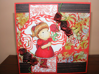
Tilda, roses and things

Sometimes you just have to face a fear head-on. Regular viewers of my blog may have picked up on the fact that I have a little fear of Tilda, and it's not completely irrational. The featureless children make me a little uneasy if I am honest as the human face as a mouth and a nose as well as eyes... I know I am not alone in this fear too as I saw somewhere on my travels round t'interweb a tutorial for adding features to the faces! A while ago I picked up a couple of Tilda stamps on a sale table and I decided that I was going to be brave and have a go. This is the second one I have done now and they still freak me out a little!


Over at Crafty Cardmakers this week we have a challenge running for Anything Goes!  We've all had a bit of a break over the summer months with one thing and another and this is our first challenge with the newly formed team so it would be lovely if you could pop over and have a look what we have all been doing :)

I have coloured her in red promarkers for the dress etc and used shades of ginger for the hair. I have made all the background papers myself with a combination of repeated stamps and a background stamp I have. The multi-coloured background is made with adirondack inks, dabbed around to make a blended background, then stamped over with clear inks and embossed with clear powder so the colours would show through, then brayered over with red. I really liked this technique and have plans to use it again with snowflakes and the like on xmas cards. At the very back is a piece of Core'dinations black magic paper, embossed with a stripy sizzix plate and then sanded to oblivion to bring out the stripes.  The circles are cut with both plain and scalloped edge nesties. I have layered the card up with red paper to trim and used a scrap to cut a strip of butterflies as a ribbon across the card. The roses are also made using Core'dinations paper roughed up with sandpaper (to match the background) then die-cut using a rose making die. I love the way these form as it just doesn't look like it will work when you are looking at a wiggly spiral of paper but a bit of careful rolling, a good splodge of tacky glue and a hold for a few seconds and hey presto, pretty flowers! The spirally bits form magically when you cut a very thin strip of paper using a blade and a metal ruler.  I discovered this by accident and think they look really pretty and give a bit more dimension to the flowers.

So there it is, a Tilda card, and my second one at that!  As I have been so brave, I am would like to enter this one at Just Magnolia as I have used their sketch for this card's layout.  Papercrafting Journey want to see die-cuts or punches.  Creatalicious Challenges are running one for Anything Goes too :)

Sunday 25 September 2011

The creation of a thousand forests is in one acorn...

It's autumn again.  Not that I think summer ever really happened for us here in the UK, it's been a bit of a miserable one.  OK, we have had a few nice days and it hasn't rained all the time so have to think positively really, and it has made all the garden grow, especially the weeds which have been steadily taking over my garden.  Seems as soon as I have got to one end of the garden and cleared them all, some more have poked their ugly little faces through the ground and sit there taunting me.  A friend of mine bought his wife some sort of flame-throwing weed killing device which greatly appeals to me and the mere thought of this caused me (and his wife apparently) to laugh maniacally. Bwahahahaha!  Die weeds!  Die! And the flipping oak tree which has been taking a battering in the wind and bombarding my car with acorns... Oops I am being negative again. Hehe

I've rambled previously about how autumn is my favourite season and I have to say I am not enjoying this one so far.  My little boy started school at the beginning of September and the weather has pretty much been lousy every since.  First day the rain was blowing sideways on our journey home, and wasn't that the day we decided to go the longer route so he could let off a bit of steam on the way back?  Then a few days later the heavens opened exactly to coincide with the time my daughter came out of school.  I think it was the tail end of Hurricane Katya as we had mega gusts of wind, rain and hail blown horizontally into the poor children's faces as they were walking home.  First I knew of anything was hearing the screaming from outside of children who were getting shotblasted with little balls of ice.  It had been so nice earlier in the day too!  Then the sun came out and we had blue skies.  Confused.com lol

Anywayyyy, onto my card.  I'm sure you don't need to hear quite so much about the weather eh?  I have used the beautiful Sweet Pea Stamps ching-chou kuiks Come Softly, coloured with Promarkers.  Yes, I still love colouring in ;-)  I've been practicising hair and trying to get shine into it rather than it just appearing flat.  I think I am getting there slowly, but still have some way to go.  I have used just pink, brown and cream colours to colour the main image and then created the background directly behind her with Adirondack ink dye pads blended in with my blender.  I was very pleased with how it turned out and even more pleased when I realised it was a perfect match for some Basic Grey 'chantilly' paper I had.  I have used that at the back of the card and used some other Basic Grey papers 'two scoops' and 'blush' to build the card up.  I have followed the sketch at CASE study for the layout, with the stitching and the panels.

Now, back to autumn, and that darned oak tree.  Last week it dumped a great big branch, laden with little acorn cups, onto my driveway and as it wasn't raining (for once) I picked it up and took it into the house and let it dry out a little more as it look perfect for autumn projects.  I cut a small piece off and sprayed it with gold shimmer mist and I love the effect.  I finished off with 3 ribbons tied together into a bow.

I think the oak tree is having it's revenge as I type as I have just heard another load of acorns hit my car *sighs*

Friday 19 August 2011

Vintage - It's the old brand new!


It is easily overlooked that what is now called vintage was once brand new. - Tony Visconti

I love vintage clothing!  I am particularly fond of fifties style dresses and as soon as I find an occasion to wear one I will sooooo be in one!  I love the sticky out skirts and the starched stiffness and the net skirts which go underneath.  I also like the necklines, halter necks and wraps, enhancing the décolletage which give a really sexy look but without revealing too much and retaining that important air of demure.  I was thrilled to find that Michelle Perkett Studios are running a 'Vintage' theme to their challenge this time round and was even more pleased with the stamp they had on offer as a freebie.  This dress just rocks!  I seriously want to wear it!

I have coloured the main image with promarkers in vanilla, rose and baby pink to match a piece of backing paper I had in mind for the card.  I cut it to an oval shape then cut a slightly bigger oval from some Coredination paper which I ran thru my Sizzix with a polka dot embossing plate and then attacked with some sandpaper to bring out the dots.  The rest of the backgrounds I have made myself using a combination of a background stamp and a brayer to apply adirondack caramel ink.  The very back of the card is made using just the run-off ink left over from inking the stamp.  Brayers are fab for applying ink to that sort of stamp and always have plenty of ink left to make some paper.  Nothing is wasted!  Regular visits to my blog will know I love making my own backgrounds.  I have lots of designer papers but nothing is quite as much fun as making your own.  I am forever on the lookout for new ideas of things to do like that.  The DP I have used on this one is designer unknown... I have a habit of picking up papers just because I like them and think I could use them and sometimes pick up odd sheets here and there so I end up with loads that I haven't got a clue what they are or where they came from...

The paper ribbon behind the main image is a strip I had left over from another project, it's made using adirondack inks sploshed around and then stamped over with my favourite olde worlde wordy stamp.  I keyed the colours in a little by rubbing over with the caramel ink pad I used for the background.  I used some lace ribbon at the bottom to further add to the vintage theme (it's pretty old!) and added 3 amber coloured gemstone brads for that all important bit of bling!  The sentiment comes from an Anna Griffin set of stamps - stamped then embossed with gold.

I have used the sketch supplied by PaperWorks Co.  Creative Stamp Friends challenged us to make our own background so that's what I did!  Digi Design House wanted to see 2 patterned papers, a ribbon and 3 brads.

Monday 15 August 2011

A Summer Daydream

It's summertime, apparently.  The weather most of the time would suggest otherwise!  Apart from the odd couple of days of sun here and there, we seem to have been cursed with grey skies and miserable weather on the whole.  6 weeks of 4 bored kids who I can't even take to the park to run off some energy because you can never be quite sure what the weather is going to do next... My elder son has ADHD and to coin a term of his Grandma 'is like Tigger on speed!' and I think if I haven't gone completely grey by the end of the year it will be a wonder.  He's off to big school in September and it will be a break for us all, especially my youngest who is 2seriously attention starved as his big brother hogs it all.  The poor baby is a boy of very few words, mainly because big bro says it all for him - he never gets a chance to get a word in edgeways!  Still, he has words for his favourite things, like juice, banana, kitchen (where the food comes from!) and perfect.  He learnt 'perfect' a couple of nights ago as he was looking at the word on his vest and I said what it was and he started repeating it. I was thrilled!  So now, when I get him ready for bed he waits for me to give him a new word.  Tonight's was 'maiden', which has pleased his Daddy no end as he is a big Iron Maiden fan!

Summertime when I was child was my favourite time of year as it meant a long time off school, always off out with my friends playing out somewhere and getting into scrapes.  I will have to put on my rose-tinted glasses for while and remember the sights and smells of summer - I just remember that there was always lots of flowers around.  I don't think a lot of people seem to have time for their gardens anymore - I know I don't get much chance with looking after the children but there is nothing nicer than a garden in bloom.  My daughter seems to be quite happy to stay indoors drawing or on her laptop which just seems really alien to me as when I was her age, I was never in the house.  She's probably saving up all her energy for going on holiday next year with my sister.  They are going on a cruise now she is finally in possession of a passport :-)


Flowers are very popular in the world of craft too.  The digital stamp I have used for this project is one by Michelle Perkett and is called Daydream Fantasy.  I have had it in my collection for a while and to be honest, I have never used it as I thought it looked too complicated, but today I decided to be brave and give it a go.  I don't have the fancy new fine-tips for my promarkers yet so I just had to be very light and gentle adding the finer detail of the flowers.  I've used carmine and magenta for the pinks and olive and pear green, plus a little saffron and yellow for the hair.  I've used stickles and cosmic sparkles to add a bit of shimmer to the wings and the leaves, in fact I added shimmer to it all!  What you are looking at is actually the front cover of a notebook.  I will be demonstrating how these are done in my next blog post as this is actually the fifth one I have done.  I added a few more flowers to give more of a summery feel in pink and purple.


Just added this extra shot to show the sparkle a bit more :)


And also added this to show that it is a notebook :)

I'd like to enter this for the Craft Your Passion Challenge for Anything but a card.  Make My Monday want to see a Fairies or Angels.

Tuesday 2 August 2011

Sparkle and snowflakes and just a touch of red

Just been having a root through my blog and found this which I hadn't posted!

This time of year always amuses me.  How do you do Christmas when you're not religious?  You may notice from my recent bloggings, I just don't do Christmas at all!  I think I have done fairly well so far to produce a few Christmas card which are neither religious or traditional and don't actually mentions the C word at all.  I'm not a descendant of Scrooge, honest, I just loathe all the commercialism that surrounds it all.  So, given the choice, I will choose wintery themes, snowflakes and sparkle, only this time I decided to go for something a bit different.

I am obsessed with red.  Well actually I'm not as obsessed as I used to be, but that is probably because now I have a full house and lots of kids running about, there isn't as much opportunity for all the little knick-knacks I used to favour.  You should see the state of my lovely red candle set after they got toddlerified lol  So every so often I decide to indulge myself and do some crafting in red, and this time of year gives the perfect excuse.  I can do festive if not Festive right?

The image I have chosen for my card is Sweet Pea ching-chou kuik's Fluttering-butterflies.  It's a really pretty stamp and I have had some stamped images on paper sitting around for a while, just waiting for me to decide what to do with them and I was flicking thru the stack and spotted this and just knew she would look stunning in red and green.  I coloured the dress and wings in a combination of poppy and forest green promarkers and the moon and lantern with buttercup and vanilla and touches of gold.  The background is coloured with indigo blue, and the skin with almond and dusky pink. Hair I coloured with cinamon and gold and I think it looks like her hair has captured the moonlight.  For a bit of added sparkle I have used my trusty gelly roll pens - always good for a bit of bling.

I am rather fond of my nesties, would love to be able to buy more but they are soooo expensive, definitely worth it but still!  I trimmed the main image using the biggest in the deckled rectangle set and had a bit of an accident where it wasn't lined up properly so I shifted the image up a bit and cut it again and hoped for the best and luckily it cut straight so I got away with it, phew!  I love my starburst stains and had made a sheet of red card which I used as the background  then I used some red glitter paper from my stash to trim the edge and cut again using the largest die out of an offcut of the starburst background, but I didn't think it stood out well enough, so I dipped the edges in glue and then in ultrafine red glitter to make it really sparkle.  Coloured a few flowers with poppy and dipped their edges in glitter too, and the coloured a peace of lace ribbon using poppy again.  This I placed along the side of the glitter paper and offset the red card and the image and put that on and added the glittered flowers.  I used a few red gems to add an extra bit of sparkle.  I knew the card needed a bit more, but I couldn't think what.


When I visited The Stampman a few weeks ago, Vix was demoing triple embossing and although I tried it as soon as I got home, I couldn't quite get the hang of it, but I had to have a go again for this card.  I was lucky enough to get some Christmas shape chipboard a while ago and in there I had some stars in different sizes.  I used moonglow angel wings ruby and layered it up using my heatgun and then stamped into it with a snowflake stamp... and it worked this time!  I attached the stars to a a thin piece of ribbon and punched a hole in the card, added a yellow star (which I coloured up a little with pink promarker so it wasn't so yellow and attached the stars so they hang freely like a tree decoration.

Monday 18 July 2011

CCM Spotlight on ATCs - Hope I have got the idea now

Hello again!  Long time no blog lol

So what have I been doing whilst I've been gone?  Oh the usuals, taking care of my family and working... it's like having two jobs and I am lucky that I have two jobs which I love! Sometimes when things get a little busy in both jobs I find I have very little time to do any crafting and that's what has happened lately.  I seem to have spent the last few weeks either organising something, working, or taking care of poorly children.  We held a joint birthday party for the boys as they turned 2 and 4 within a few days of each other so a combined afternoon tea was the perfect choice, slapbang in the middle of the two birthdays.  Then the next day was spent making sure that my daughter had everything she needed to go on a camping trip with her school.  She's back now and is a little pink with sunburn, and apart from moaning about having to sleep in a tent, I think she had a good time :)

In a quiet moment to myself, I managed to have a little catch-up crafting session and get something done! Yay!  Crafty Cardmakers is such a good place to find challenges which well, errrr challenge you!  I have learnt so much since being on the DT there and occasionally a challenge or spotlight is set and I read the brief and thing OMG what the heck am I going to do for that, go away, hyperventilate a little and then have a think about how I am going to go about it and then go on a little googlehunt for something which will help me find out what it is I am supposed to be doing.  The girls at CCM are fab as they always have good ideas and I am truly in awe of some of the samples which get produced to provide inspiration.

The Spotlight this time is on ATCs.  I remember having had my ticket to go to Port Sunny last year for a couple of weeks and we had got to a few days before when Vix told me that at a certain time in the day, everyone meets up to exchange ATCs.  Moment of panic!  I wasn't even totally sure what an ATC was, let alone had made any... so once again google was my friend and I learnt that day that an ATC is usually 3 and a half inches by 2 and a half inches and you create a mini work of art.  I must apologise now to anyone who got one of mine on the day as they were truly awful!  I didn't have a clue what to do with them and cobbled something together in a rush... and it showed lol  So when this Spotlight came up I thought oooooh now's the time to face my fears and have a go.

I cut some cardstock to size and decided to steer away from the mono-dimensional abominations I made last year and go for some texture.  I tore up some sellotape into small pieces and did the same with some masking tape, added some pieces of linen from a reclaimed storage drawer from under my bed (drawer went to tip lol) and added some paper diamante centred flowers and then coated the whole piece liberally with pva. Then I had to wait for it to dry so I could carry on... I don't like having to wait, so I went to bed lol  When I got up I applied some alcohol inks using some a kitchen sponge cloth , added some shimmer with mica powders and stamped over with good old stazon ink... well I doubt anything else would work on that background lol  Unfortunately the shimmer has made it pretty difficult to get a decent photo so I hope the one here will do.  Might try and do another one outside in daylight - just hope the weather behaves itself ;-)

Monday 13 June 2011

Crafty Cardmakers - Use a Food Container

It was my turn this week over at Crafty Cardmakers to set the challenge and I had a think about it and then decided to take my inspiration from something I love... FOOD!  Hehe!  Food is fab, we need it to survive and it comes in packaging of all shapes and sizes and how often do you end up dumping it in the bin when it could be used for something else?  So why not have a challenge to make something else out of a food container?  It could be a jar, a tin, anything at all which once contained food.  I am a bit of a hoarder when it comes to that sort of thing, and my craft room is packed with lots of things which I think might come in useful for something at some point.  I just pity my poor fella who has to share the room with the tiny little computer desk I have allowed him to have in the corner lol

My inspiration this time came from a combo box from a well-known pizza chain.  I really love their food and especially like the combos that they do with chicken strips and potato wedges.  It just seem such a shame to throw the box away and I decided to have a go at making it into something else.  It already folds up to make a funky shape, and has holes in it to contain the dips and that set me thinking.  Why not make it into a funky gift type box to hold something else?


I set about painting it with white acrylic paint to start with as the company logo is emblazoned on the box in strong colours so it took a few coats to white it out to give me a nice base to work on.  It was only after having a chat with the manager of the shop who let me have a new unused one that I realised that if I had folded it the other way it was white to begin with and I wouldn't have needed to use so much paint.  Doh! Never mind eh? I had gone this far already so decided to plow on.  What's the point in getting this far with a recycling project to only go and throw it away?

Once the paint had dried, I sprayed it all over with some Adirondack color wash and let it dry then stamped with some stazon using a swooshy stamp and let that dry too.  The dip holes are a perfect size for putting a tealight into.  I wouldn't recommend using real tealights unless you want to set your box (and probably your house too) on fire, instead use battery operated tealights which you can usually pick up quite cheaply from the likes of Hobbycraft.


I shredded some tissue paper to make the packaging inside.  Now, you really could put anything inside this.  I have put an outdoor tealight holder which you can hang from the branch of a tree, or even your washing line to add a bit of mood lighting to your bbq.  You could use it to put make-up or even jewellery in and if you added one of the stick on mirror panels which you can generally get for a quid or so, it would provide a nice gentle light to put your jewellery on by.  Tidy.

Tuesday 31 May 2011

The Fabulous Mad Madam M

I have been wanting to get my hands on this Stitchy Bear stamp ever since I first saw it in the banner at OSAAT.  This is my daughter.  Well it isn't actually my daughter, she's 12 and a touch more three dimensional than this picture lol  but this is my daughter's fashion sense!  Well I suppose I am probably to blame for that as I have never been known for my eye for fashion either, but DD loves her clothes and sometimes likes to wear as many different colours as she can, all at the same time!  Well nobody could ever accuse her of being dull.  Unfortunately she didn't come supplied with sunglasses for everyone who looks at her.  Don't think by reading this I am being mean by the way, she is sitting next to me whilst I type wearing a purple t-shirt, a platypus coloured cardigan (her description - I think it refers to her TY Patti the Platypus, but I can see what she means) and a knitted cream hat, complete with cat ears... her Havana cat is currently chewing my socked foot (he has a fetish for socked feet) and she has just had to run into the kitchen to get him to follow her.  It worked!  We have lots of random moments in this family I can tell you!


At Crafty Cardmakers this week, our challenge is Love The Lasting Kind.  I don't think there can be any better display of love than the love a mother shows to her child.  From the first moment they are placed in your arms after you have given birth to them, nothing ever compares to that.  The overwhelming emotions of holding this tiny little bundle (and believe me, my DD was tiny!) and knowing that they have been growing inside you for 9 months and they are finally here, out in the real world, small and vulnerable and needy of everything to survive.  I think those in the midwifery profession call it bonding, I call it pure, all-consuming Love.

Things haven't always run smoothly for my daughter and I.  She was only 6 and a half years old when I finally decided enough was enough and turned my back on her father, and left her to live with him as it seemed to be the best for her at that time.  I still maintain that it was the best then as I needed time to sort my own head out but it hurt me, and more sadly it hurt her.  I think she felt I had rejected her too, but I made it up to her, slowly but surely and as she grew older, she realised that the parent she really wanted to live with was me, someone who would be there for her all the time and not just pass her around relatives because they couldn't prioritise family over work commitments.

Whoa!  I am getting really sentimental here!  I am supposed to be talking about the card! Hehehe!

The stamp is a digi stamp from Stitchy Bear Stamps and I have coloured her with promarkers and added depth and definition with black polychromos pencil.  I ran round the edge of the image with cool grey 1 and cut her out to make the image pop out more from the background.  The many background papers I have chosen to co-ordinate with the main image - mainly because I have used so many garish colours on it, I had a great job finding just one which would do it, so I decided to layer it.  The 'flowery' part is drawn freehand onto sticky backed canvas with Derwent Inktense pencils to match the leggings on the main image, then edged with bright pink then torn to reveal orange.  The orange is torn to reveal hot pink leopard skin print - this is in homage to a similarly coloured pair of leggings that DD wore to death, until they finally didn't fit her.  I created this paper with an Anne Geddes stamp.  The lime green, final part of the topper is embossed with a stars embossing plate in my Sizzix.  I then backed the whole lot onto black paper and added the 'Fabulous' sentiment which is an embossed stamp from the same Anne Geddes stamp set, I have used orange, red and black then coloured the background with Inktense pencils and trimmed to size.

Sunday 29 May 2011

Whoa! This is a bit pink for me!

Wow, has it really been 2 weeks since I posted anything here?  Life has been busy busy busy for me lately, having 4 children in the house certainly doesn't leave much time for anything else.  I wouldn't have it any other way really!  Since I last blogged, my beautiful daughter has turned 12 and it amazes me everyday how lovely she is, so mature for her age, she certainly has got a good head on her shoulders, is doing brilliantly at school and I am sooooo proud of her!


Well this card is a bit pink innit? lol

Over at Dream Valley Challenges we are running a challenge 'Stamp Something'.  I love stamping!  I remember before I started making things that I always thought stamps were just something you used to decorate a card or other project, kiddie crafts almost.  How wrong was I? The lovely stamp I have used for this project is a Jasmine Beckett-Griffith one of the fabby stamps you can buy from Crafts and Me Stamps.  I fell in love with this lady's work a few years ago when I was in Lincoln with my darling OH and we wandered  into Salamander a truly awesome new age shop hidden away up a sidestreet.  They had just taken delivery of a selection of greetings cards designed by her and one of them really caught my eye as, to me, she was the spit of my daughter.  I was over the moon a few months ago when I learnt that I could now get stamps of her designs!  I have coloured the image with promarkers in shades of pink and added some sparkle to her wings with gelly roll pens.  I used my scalloped edge circle nesties to create the circle behind, which I used to cut out from some paper I had made previously with cosmic shimmer mists, then embossed it and sanded it to distress it a little.  The rectangle behind the ribbon is some more of the paper stamped with some inkadinkadoo stamps. Behind that is a selection of Anne Geddes papers which I acquired on one of my swoops at the QVC shop and some meshy ribbony type stuff which I think is lovely.  Oh and don't forget the bling, always have to have a bit of bling lol

Friday 13 May 2011

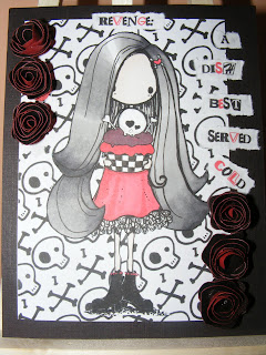
Revenge - A Dish Best Served Cold

Don't you just love that phrase?  It's true isn't it?  Why rush in when someone wrongs you and give them the reaction they want, just leave it... don't forget about it... leave it until they think you have forgotten about it lol

I have used a fab Tiddly Inks digi for this, she's called Pinky and if ever a stamp was more suitable for this phrase I have never found it.  I mean come on!  She's standing there with a skull on top of a cake!  I don't know who cheesed her off, but I don't think I would like to get on the wrong side of her, would you?  That girl has issues lol  I have used just 6 colours on this card, black, red. grey, purple, white and satin for the skintones.  Not that I have given her much skintone at all, she's as pale as me... in fact this could be an alter-ego of me!  The background is also from Tiddly Inks and is called Toasting Properly.  Goes perfectly with the image I think and the general feel of the card.  So with 6 colours, I added 6 paper roses, made using a diecut and a few scraps of coredination's paper as it is red on one side and black on the other and it gives such an impression of darkness to the petals.  And of course, 6 words too.  I used a ransom note style font which my lovely stepdaughter gave to me.  Sometimes it is so handy to live with a font geek!  So there we have it... 666... The number of the beast.  Scared yet?  You should be!  HDH Challenges, you've just gotta love 'em!  Mwahahahahahaha! ;-)

I'd also like to enter this in The Burtonesque Dolls zombie challenge.  I can just imagine a zombie serving up a skull cake.  I think it would be damn rude not to hit up the Tiddly Inks Anything Goes challenge with this one, I hope I have done it justice Christy!

Monday 2 May 2011

Magical fairy wonderland

We call them faeries. We don't believe in them. Our loss. ~Charles de Lint


I was talking earlier today with my daughter, whom is now almost twelve about the fancy bedding we can get for kids these days.  I grew up in the times before duvets (sheets and blankets for me!) and children's character themed bedding, and whilst my son has Rubbadubbas, Thomas the Tank Engine and Bob the Builder and my daughter had Jellikins and Hello Kitty, I had none of these luxuries.  I said to her at least you have never had to suffer hideous wallpaper in your bedroom (her rooms have generally been painted - apart from when she was a baby and I decked her nursery out with Peter Rabbit borders etc - only to be told when she was old enough to speak that she hated Peter Rabbit - Meh!).  I described the wallpaper I had growing up in the 70's as a pink and lilac floral nightmare!  This was replaced around the age of 6 or 7 by green woodland fairies.  I was never particularly into fairies (I was into Adam and the Ants at the time!) but my Mum loved it and bought it and decorated my room with it and I still had it on my wall at about 13 years of age - albeit covered up with as many posters as possible!
I've been raiding Vix's stamps again lol

One of the stamp ranges which they sell over at Crafts and Me is a rather fabby artist called Hannah Lynn and I love them!  This one is called Bookworm Fairy and I decided she would look just lovely coloured with pink and turquoise shades of promarker and added some definition with a polychromos pencil.  I treated myself to some stickles a few days ago and have added some to the wings and the frondy bits of the butterfly and it does look very sparkly in real life, but my camera has managed to completely not capture it in this shot!   I also added some stickles to the lantern as they tend to reflect the colour of the bit underneath so it really looks like it is glowing.  Again you will have to take my word for it lol I trimmed the image and gave myself a near heart attack when I was cutting the frondy bits as I have a habit of cutting them off, but miraculously I managed to leave them attached - Go me! lol I have created the background using cosmic shimmer mists in a blend of greens into blues, (I've not tried a blend with the colours before), then stamped over the top with the frame from the Starburst Fairies stamp set from The Stampman.  I trimmed the frame leaving a narrow border and glued the image to it.  Doesn't it look like she is in a magical fantasy land?

I made the card into a twisted easel as I had more shimmery card left from earlier and stamped with some sentiments from the Starburst Faires set and added some gems for a bit of bling in pink and turquoise colours.

I followed a couple of challenge themes for this card, Stampalot have one running for Magical Worlds and I don't think you get much more magical than a fairy woodland scene.  I chose the colour scheme from The Corrosive Challenge for Turquoise and Pink.  Sweet Stampin' want you to try something new, and I tried a new technique with my shimmer mists - I usually just spray all over and hope for the best lol/

Steampunk fairy

Over at Crafty Cardmakers this week we have a spotlight on Steampunk or machines.  Well until I set to work on planning for this challenge, I had never really done anything at all like it.  From other things I have seen around the web, I knew cogs and modern type machines made in a Victorian style was the key and I was a bit wary of how to start.  Luckily I stumbled across some digi stamps from Delicious Doodles and bought a few to have a play around with and I think I can safely say I am a little hooked on darker things at the moment!  As I said in a previous post, I like gothic styles and the steampunk genre fits in quite nicely I think.

I started by colouring the image in with promarkers, aside from the skin tones I really limited myself on colours to red and greys and a touch of green for the rose leaves.  I wanted to keep her skin pale and interesting so have only lightly shaded it.  I have used a black polychromos pencil to add shadow and make it pop out a little more.  Directly behind the main image (which I trimmed) is a piece of core'dination paper, embossed and sanded gently to bring the red from out of the depths of the black.  I have a few embossing folders which I rarely use, but core'dination paper is fab for making use of them.  The panel behind is some black and white design paper from my stash.  I am not sure what make it is as it didn't have any labels, but I bought it from Carole's Crafts.  Behind that I simply used a scrap of black lacy material stretched over card and a broad piece of black satin ribbon to continue the black and white theme I seem to have going on here lol

So what's the steampunk feature?  The cogs of course!  I cut them out from a template and coated them with aged metallic Perfect Pearls powder, spritzed and battered away with the end of the powder brush whilst the powders were still damp to create a distressed aged metal effect.

I followed the sketch at Hanna and Friends for this card.

Wednesday 20 April 2011

Gothic pin-up girl

There is just something about the whole gothic style of dress that inspires me.  This probably stems from having grown up in an era where the likes of The Mission, Sisters of Mercy and The Cure reigned the charts and the dress-code for that type of music was out of this world.  Long flowing coats, long flowing locks, make-up, long boots, bodices, waistcoats....  It's all just so dark and brooding and fab! I like to think I was a goth at some point in my life (my sister will tell you different tho lol) but the most goth I got was dying my hair black and dressing in black all the time and a bit of dark make-up.  Well apart from the last bit, what has changed as I am sitting here with dyed black hair and dressed top to toe in black? Oh that and the girls were always skinny and tall, neither of which I have ever achieved Hehe!

The image I have used is a fantastic artist I have found called Teri who sells her digi stamps under the name Delicious Doodles.  I found her art when I was looking for some steampunk digis and I fell in love with this one.  A true gothic fairy!  I have coloured her with a combination of promarkers and prismacolour pencils to make the wings 'pop' out.  The background behind the image I created by running some coredination red/black paper through my sizzix in an embossing folder, then sanding it gently to bring the colour through and then distressed the edges a bit more with another session with the sandpaper.  The swirls are Tim Holtz diecuts which I had cut out in red then attacked with some shimmer mists.  The main background is a black shiny crocodile skin paper I found in a Anna Griffin papers set and I thought it was just perfect to go with this theme.  The flower I made myself with a spare scrap of the background paper and a smaller flower made out of the coredination paper, run thru a snakeskin embossing folder then sanded off again.  The centre is a brad.

I think I might have got a bit carried away with my set-up for the photo of this card with the candlesticks, rose and wand, but I felt they just matched the gothic theme so well!

I would like to enter this card into the following challenges:

Haunted Design House - Gothic Pin-up
OSAAT - Make It Sassy
Simon Says Stamp - Emboss It

Monday 18 April 2011

Love is in the air?


I think you would have had to have been in hibernation for the past few months to have not realised that there is a Royal wedding at the end of this month.  Everywhere you look someone is flogging something to do with it, there are posters advertising events at pubs on the day and we have all been given an extra day off!  The extra day off is the highlight of it all for me, I don't really give two hoots about the Royal family to be perfectly honest.  Looking at some of the photos of Kate Middleton from prior to the engagement, and then after the engagement, nobody can deny she is a pretty young girl, but already the Royal machine is in motion to turn her into a fuddy-duddy who dresses like a 50 year old woman at a WI tea party!  Look what happened with Diana if you don't get what I mean.  She was only very young when she got engaged to Charles and in a lot of the early formal photographs she looked like she had been dressed by her Grandmother!  The people I really feel sorry for are any couples who have had the same date picked out for their own weddings for the past couple of years (you would possibly not believe how far in advance you have to book to get the church, the venue, the cars all on the same date etc Then your whole day gets hijacked by the Royals! Meh!

Anyway, moving swiftly on as they say....

I haven't been to an actual wedding for years, apart from evening dos.  The last wedding I went to I think was my ex sister-in-law's wedding in 1999!  My daughter was only a couple of months old at the time and it was an unusually hot day for the beginning of September, I was still breastfeeding her, she was getting restless because she wanted more grub or to go to sleep (probably both!) and my deranged old bat of a mother-in-law (which is what her darling son used to refer to her as) was insisting that I had to hang around until the photographs had been done.  The photographs took the best part of two hours, I was only called to be on one of them and I never actually saw the finished album.  So what was the point of putting me and my daughter through all that discomfort!  Oh, I am still ranting.... oops!

Moving on again... lol  *Thinks happy thoughts of love and harmony*

As I haven't been to a wedding or known anyone who has got married since I started making cards, I have never actually made a wedding card in my life.  Remembering back to the ones I received at my own (FAILED) wedding, they were all white with wings and toasting champagne glasses and pretty little doves.  Over at Crafty Cardmakers this week we have a challenge for red, white and blue and/or a wedding card so I have chosen to do both.  The image is one that I asked Vix to print out for me and I have coloured it simply with red and blue (with grey for the trousers) promarkers with a touch of gelly roll shimmery pens here and there.  It's a good thing that a lot of brides get married in white as it made it VERY easy to colour her dress... there was the white without me even having to lift a pen lol  I trimmed the image to size then used my hearts corner punch and back onto red paper so the hearts show up in a nice way.  I have followed the sketch from I Love Promarkers as it was just perfect for my plans for this card.  The 'congratulations' design paper is one I made myself in good old MS Paint.  The satin look paper is a free one I found whilst trawling the net in search of something to match my image.  See I usually do it this way round which is why it was so unusual for me to plan ahead and key my colours in with the DP on my previous post!  I have backed each of the panels with red and added some red gems for a bit of bling and a paper rose which I re-coloured with berry red promarker to match the flowers and bits and bobs on the happy couple.  I think I have kept this pretty clean and simple really.

Well I hope you enjoy the extra day off, whether you spend it tuned to the box with one of the Dimbleby's droning away (or whoever the Beeb pick this time), having drinks in the local pub or maybe just spending some time with family.  Enjoy!

*Hugs*  Sarah

I would also like to enter this for the following challenges:

Happileigh Scrapping - A Royal Challenge
Polka Doodles - Tie The Knot

Bunny in my pocket

Our challenge over at Dream Valley is to create something to do with Easter, and what could fit the bill better than a bunny?  Cute little chap isn't he?  I'm not sure where I picked him up but I think it was a spring freebie last year, so if anybody recognises him, could you please let me know? LOL

I have coloured him with promarkers and, although it hasn't shown up very well on the photograph, I coloured it a few more times and have paper pieced it to make it a little 3D and Digi Design House want to see paper piecing.  I have followed the sketch at The Sweet Stop which has a bit of a twisted theme this week, hence the angle, and wanted to see something with wings and the butterfly fits the bill there I think :)  The 3 design papers I have used are from my stash, not sure what any of them are as I found them all in little leftover bits during a paper sort-out.  I bought a set of drawers to organise all my papers and somehow I still have a box cram packed full of odds and sods.  How does that work? *Confused face*

The flowers are from a set my other mum got me on one of her trips to the states.  I'm not usually a pink person and so haven't used many of them before, but I think they look just fab stacked with the gems in the centres.  The brackety bits are using one of my nestie sets and cut from some paper I made a while ago and the ribbon strips are Kanban I think and the meshy ribbon in the background is from the big roll I bought a few weeks back - see I said you would see it again didn't I? lol

I made the sentiment using a scalloped nestie and a peel-off (shhhh) which I coloured in with promarkers to match the image and then doodled the flowers, faux stitching to tie in with the main image, and the text freehand.

Thursday 14 April 2011

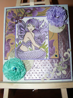
Passion for Purple Promarkers

When I am an old woman I shall wear purple, with a red hat which doesn't go and doesn't suit me, and I shall spend my pension on brandy and summer gloves, and satin sandals, and say we've no money for butter ~ Jenny Joseph (I love this quote!  It's so ME! lol)

If you were ever to visit my house or look in my wardrobe, or indeed view the photos from my handfasting, you would probably be thinking that my favourite colour is red.  Well you would be wrong.  One of my lesser known secrets is that my favourite colour is purple.  I have always loved purple.  It's just such a lovely colour and there are so many variances in shade, plus with my dark hair colour and anaemic complexion it is one of the colours that adds colour to my pasty white skin and doesn't leave me looking washed out.  Oh and it usually looks fab with my green eyes! ;-)

The stamp I have used is ching-chou kuik's Dark Royalty from Sweet Pea.  Yes, it's another Sweet Pea!  I just love their stamps and as purple is my favourite colour it fits the In a Sweet Pea Dream challenge.  I have coloured using a range of promarkers in shades of purple (my favourite) and green, and for once, I chose my DP first and then coloured the image to coordinate with the colours in the paper.  This may not seem unusual to many people, but believe me, it is highly irregular for me!  I usually set about colouring an image and then discover that I have no paper to match and have to reach for my stains and shimmer mist and create my own.  Well as you can see I have actually used a panel of my own, which was made with shimmer mists then embossed with a polka dot embossing folder.  Felt quite strange to be so organised for once!

I was so organised, I even sat down and made all my embellishment flowers, as challenged to do by Passion for Promarkers, to match. I had a great time with my coffee filters and stains and heat tool. Made a batch of 3 large flowers - 2 turquoise and one purple, and 4 small purple flowers, all with gems and pearls in the centres with the full intention of using them all, but I went downstairs this morning to find der der der! No small purple flowers... seems my dear cat has been playing with them (I found one of the turquoise flowers in the bin next to my desk).  But now I am worried as the rest are nowhere to be seen and he has a habit of eating random thinks so he is possibly going to pass some very interesting poop... cats, grrrrrr Anyway, the few flowers he had left me to decorate my card with had escaped intact.

I have assembled this card following the sketch at The Sweet Stop as the moment I looked at it I could see all the papers I had planned coming together, great when I plan eh?  The main design paper with the large purple flowers on it is one I picked up in my local craft shop and even though it came in a pack of 10 sheets of the same paper, I just had to have it!  Might take me a while to use it all though...  The DP on the circles behind the flowers and the bracket at the bottom is from a Laura Ashley set.  The panels are either trimmed with purple paper or with purple edging borders to coordinate with the image and papers. Oh and then I added a couple of turquoise gems to finish off.  The colour scheme fits perfectly with Sketchy Colors challenge for turquoise, purple and green too :-).  I hope my gems will pass for pearls for the Magical Monday Challenge too, the card would have had lots more pearls if it hadn't been for my darn cat lol.  This is probably going to end up as a birthday card for one of my mothers so hope it fits in ok at Sweet Pea Stampers as it is a feminine card and uses a Sweet Pea image.

Wednesday 13 April 2011

It's a bit bright...


I've been having a fiddle about again!  I recently discovered that the box of coffee filter papers I had stashed away at the back of the cupboard (left over from the time we had to use an old style coffee machine whilst awaiting for the arrival of a new jug, following a toddler induced accident with the old one) can actually be put to good use in craft.  Yay!  They make the most gorgeous flowers and are pretty easy to do, especially if you have a suitable scalloped nestie as do I.  The first one I made, was huuuge and may well end up as centerpiece for a card at some point but once I had mastered the art, I became a little addicted and keep churning them out.  Well you can never have enough flower embellishments when you're into crafty stuff now can you?  Whilst the regular unbleached ones are good for darker colours, they aren't so good for lighter colours as the 'beige' effects the colour of the flower.  However, a quick search of t'interweb found me a supply of white ones, 400 of them in fact, and the colours that you get from those are much more delicate.  The first batch, which I used on this card, are made with the unbleached filters and cosmic shimmer mists.  They came out really well with the purple and green I had, and the mica shimmer looks lovely on them. They are held together with a tiny little brad and have a nice diamond pearl in the centre.  I enjoy making these so much that what the hey, I think I am going to do my first ever tutorial on them!

The image I have used on this card is Sugar Nellie Web Knitter.  Coloured with promarkers and a bit of sparkle added to the leafy wings with cosmic twinkles. The DP is from my stash and the coloured papers are from my ever dwindling supply of Paper Mill papers - why oh why did you have to close your shop near me? :-( Anyway, the image was trimmed to size with a nestie and I used a scalloped nestie cut in purple to create the frame. The challenge at The Sugar Bowl is to use purple and green, a sketch and one of their own images so a check in the box on all three counts I hope.

Happily, during one of our crafting and gabbing sessions, Vixykins brought round a big Tim Holtz swirly scrolly sizzix die cut which I used to cut out some swirls in an array of colours, so I have used some paper made from purple and green cosmic shimmers spritzed onto card, which is actually the same mists I used to create the flowers.  With the pearls and swirls and magical theme I hope this one fits the challenge at Magical Monday :-)

It was quite difficult to photograph this as the shimmery bits seem to nab the colours out of the image a little and are making the paper look a little blue but they are purple, honest!

Monday 4 April 2011

Spring fever

It's spring fever. That is what the name of it is. And when you've got it, you want - oh, you don't quite know what it is you do want, but it just fairly makes your heart ache, you want it so! ~Mark Twain


Spring is fab!  Out in the garden, things are blooming and adding lovely colours to everyday life.  As we only moved to this house at New Year, I didn't get the chance to put any bulbs in, but I was thrilled when green shoots started poking through the ground and was hoping that they would be daffodils, and they were!  The bright yellow colour is so cheerful and if I could just stop my 3 year old son beheading them and bringing them to me, the garden would be full of them!  Ah well, I'm sure he will grow out of it... and then my younger son will start lol

The challenge over at Crafty Cardmakers this week is to use mainly yellow and these 3 embellishments stitching, rhinestones and ribbon, so a springtime card was just the perfect idea to fit.  I used a Sweet Pea Stamp, Jennifer Nilsson's Daisy Flower Fairy which I coloured with a range of yellow and amber promarkers and gold star gelly roll pen to add sparkle to the wings of the fairy and the bee.  I added a couple of orange rhinestones as earrings and then I couldn't decide what to do with it.  I knew I had yellow cards and things, but I couldn't think what to do next.  After a bit of a head scratch, I remembered back to a conversation I had with Vix during our Promarkers in the Park session last week and recalled that she had mentioned about twisted easel cards.  I have never done one before, so I decided to have a play with some card and see if I could do it... then decided to go two steps further and turn it into a triple twisted easel card!  It wasn't as difficult as I thought it would be, but is soooo effective don't you think?

The three panels are backed with some backing paper I made myself using yellow card and my new favourite friend, my I-cling flower stamp, stamped and embossed with orange, then diecut with my trusty old friend, my deckled rectangle nestie.  The main image was trimmed with the second largest nestie and then matted to one of the bigger diecuts.  For the front panel I printed the sentiment 'Just for you' in orange using my printer, then embellished with paper flowers I had coloured to match and added some opaque amber rhinestones for the flower centres:

I then added some faux stitching around the images with a black sparkle gelly roll so the 'stitches' would be more subtle.

For the back panel, I used the Mark Twain quote shown at the top of this post (just in case you can't read it on the photo):


The foldy bits (god I'm technical) I covered the visible side of the fold with yellow gingham paper which I had printed off from a freebie site.  For the stops for each part, I used a large flower, adhered with a sticky pad and teased the petals up so that they provide a firm stop.  I embellished the main part of the card with some yellow ribbon from my stash and was thrilled to find it matched perfectly without my having to recolour it! Yay!

What's more, the whole card folds flat so it will go in an envelope, which is always handy in the case of a card ;-)

On that matter, I would like to enter this in the following challenges:

Quirky Crafts - Twisted Easel (Hope a triple twisted easel counts!)
Paper Sundaes - Spring Blossoms (I think it certainly has a few of those!)
Basic Grey Challenges - More than one fold (check! lol)
In A Sweet Pea Dream - Hello Spring (I'd say there is more than just an element of that!)
Sweet Pea Stampers - Pack a punch (ANOTHER Sweet Pea from me - anyone would think I was addicted lol)

My other Mother...

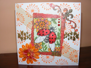
I'm quite a lucky girl really as I have 3 people who I think of as 'Mum'.  The first being my Mum, always been there for me (despite a few dodgy patches, she has come through for me) and naturally I do her a card each year.  I have already done her card, it's the green one with the teddy on it.  Then there is my partner's Mum.  Her's is the lilac fairy.  So that just leaves one Mum to make for, and that is my ex's Mum, Jean, my elder son's Grandma.  Since my son was born she has been there for me 100% of the time.  She's helped me out wherever she could, listened to my happy tales and been there as a shoulder to cry on when I have needed one and been the best possible friend I could ever hope for.  She's going through a bad time at the moment herself as her Mum has been diagnosed with cancer and as she is an elderly lady we're not expecting her to be with us much longer, so I wanted to make a special card for her this year to let her know we're all thinking of her at this hard time.

The image I have used is a Sweet Pea stamp, Ching Chou Kuik's Ladybug.  Isn't it just adorable?  I really loved colouring this one with my promarkers and I worked with a few different red pens and a touch of blender pen to create the shiny wings. The flowers are coloured with antique pink and amber with various yellows worked in.  The leaves are leaf green with emerald and moss green.  I trimmed the image with my deckled nestie and then had a rummage about for a piece of paper I had made with starburst stains ages ago, cut that with the next nestie size up and ran it through my sizzix in a flowery embossing folder.  Because Jean (who makes cards herself) is very much a perfectionist, I deliberately set the main image off at an angle, mainly because then I wouldn't have to panic about getting it straight lol

I made my own design paper for this one, choosing a simple flower and stamping it out with orange versamark ink.  I love this stamp, it was only 99p in Hobbycraft and is a Cling-it one.  I then embossed in gold some leafwork in a band across the centre and added some see-thru gold ribbon diagonally across the centre.  I used one of my new nestie shapes to cut the scrolly bit out of a bit more of the paper I had useed earlier and coloured some paper flowers to match the colours of the flowers on the main image.  The smaller flower was already an amber colour but I tied it in a bit more with a few touches of antique pink.

To make the card personal to Jean (as it doesn't seem right putting Mum on the card!) I added her name in gold to the bottom of the image.  I then finished with a couple of red gems.

I would like to enter this for the following challenges:

Off the Wall Craftiness - Colour inspiration - this is where I chose the colour scheme :-)
Passion for Promarkers - Bugs
PaperCrafting Journey - For the Ladies in Your Life
Sparkles Forum - Springtime
Paper Sundaes - Spring Blossoms
Creative Inspirations - Mother's Day
Sweet Pea Stampers - Pack a Punch
In a Sweet Pea Dream - "Hello Spring" Sweet Pea
I Love Promarkers - Emboss It

Sunday 3 April 2011

Pretty things with wings

As I said in a previous post, I have 3 Mums who I make cards for each year, and this is the second one!  I made this one for OH's Mum and as her favourite colour is lilac, I chose that as it is also a lovely springtime colour.  The challenge over at Dream Valley this fortnight is Things With Wings and this beautiful butterfly fairy fits the bill perfectly.


The image I have chosen is a wonderful one from Michelle Perkett which I was lucky enough to win in a challenge last week :-)  She is called Lilly The Fairy of Enchantment and isn't she just stunning?  I love the simple posy of flowers she is holding and those beautiful wings.  I have coloured her with promarkers on some fantastic paper I have found.  It's really good for promarkers as it doesn't bleed at all so you can really work at blending without worrying about fuzzy lines or putting a hole in the paper!  You can also print digi stanps on it with great clarity and printable design papers come out fab too.  I printed the design papers on it and you really cannot fault it.  These papers were just free to download ones and came out of the printer looking really professional so I was really pleased.  I edged round the whole stamp with a grey promarker and then trimmed the image.  I used a scalloped circle nestie to create the 'frame' round the sun, trimmed the design papers to size and then edged with some silver butterfly peel-off borders.  There I said it.  Peel-offs.  I used peel-offs.  I now expect to be drummed out of the DT lol  Well, they were needed to add a bit of bling so :-p

The sentiment is another peel-off (mwahahaha) on a deckled rectangle of the same lilac card I used round the main image and 'secured' in place (well I actually stuck it down with DST) with a single butterfly.

I would like to enter this for the following challenges:

Sketch and Stash - Sketch
Michelle Perkett Challenges - Flowers
Wee Memories - Favourite Colours

Thursday 24 March 2011

Bursting your own bubble

We live in a strange bubble. Brian Molko


There have been times in the past, whilst suffering with depression, I had described life as like a bubble, or living within a goldfish bowl and feeling everyone was looking in and observing me like I was a ruddy big goldfish or something.  Then, one day, the bubble burst and I was able to breathe more freely and see myself and my surroundings for what they really were.  I made some big life changes and have never looked back.  I am happy, I am loved and I love.  Most importantly, I stopped caring what other people thought of me and decided to be happy within myself and focus on the more important things in life.  Having fancy holidays and financial security does not shape my life at all now, instead I am happy with what I have and am surrounded by people I love and that is what truly matters in life don't you think?

I love trying something different and learning new skills and being into crafty things, this soft spot of my personality comes in very handy indeed.  I take inspirations from anywhere and anything and if I spot a technique or style I like, I am away to my craft desk to try and emulate it and master whatever it is.  One of the card styles I like is foldy cards.  I have done quite a few easel cards in the past year and ventured into trying different sorts of folds, but I spotted a different sort of fold on my travels and decided to have a go myself.


The image I have used is Michelle Perkett's Princess Oceana, a wonderful digi stamp I chose as part of my prize for a challenge I won.  Isn't it just fab?  I love the way her hair can be coloured in more conventional colours or totally differently in blue tones like I have done here.  I have used my newly acquired technique of colouring dark to light with promarkers and I think it looks like waves of water.  Well that was my intention anyway!  I trimmed her using my favourite deckled rectangle nestie and then cut a bigger one with brown paper and sprayed it with white pearl shimmer mist.  The spray adds an almost water bubbles effect I think.  I then added a couple of clear blue gems to the corners of the image.

The base of the card I folded to create three waves using dark blue card which I had sprayed with white pearl and it has come out looking like a myriad of tiny bubbles which was perfect for my plan for this card.  The papers on each wave are from stock, I can't remember where I got them from, sorry (though I think it might be papermania?) and were cut to leave a border visible on each wave to show off the effect on the card.  I think the papers look quite shell like and fitted in wonderfully with the blue and brown theme I had planned.

The next bit was a new idea to me, incorporating acetate into a foldy card... wasn't sure if I would be able to do it, but it worked.  I always worry when I do a foldy card that the recipient won't be able to stand it up on display as not everyone in the world knows what an easel card is.  Here I have used a piece of acetate sheet stamped with silver bubbles and cut to size to hold the whole thing together, so when it is folded into an envelope, it will come out and almost pop up so it will be obvious how it stands up!  The acetate is secured to the card with brads so no glue or tape is visible and therefore can't come undone (another of my fears of sending cards through the post - the recipient opening the envelope and random pieces fall out loose).

I would like to enter this into the following challenges:

Michelle Perkett Studios - Colour Challenge Blue and Brown
Fab 'n' Funky Challenges - Do it more than once (more than one fold)
Karen's Doodles - Challenge 55 More than one fold
Shannon's Sentiments - Unusual Fold